


initial-scale to something other than 1.0, so mobile browsers open the page pre-zoomed. Set it to width=device-width, initial-scale=1 and stop there. Anything fancier usually breaks the layout or blocks pinch-zoom.Element Code: HT-021
What this check flags
The viewport meta tag tells a mobile browser how to size and scale the page. It lives in the head and looks like this:
<meta name="viewport" content="width=device-width, initial-scale=1">
The initial-scale property is the zoom level applied when the page first loads. A value of 1 means one CSS pixel maps to one device-independent pixel: the page renders at its natural size. This check fires when initial-scale is set to anything other than 1, for example initial-scale=0.5, initial-scale=2, or a value combined with width in a way that conflicts.
Set below 1, the page loads zoomed out and text is tiny. Set above 1, it loads zoomed in and users see a fraction of the layout and have to scroll around. Neither is what you want on the first paint.
Why it matters
Google indexes with a mobile-first crawler, and a page that opens at the wrong zoom is a direct mobile usability problem. A few things break at once:
Legibility. A sub-1 scale shrinks everything, so visitors immediately pinch to read. An above-1 scale crops the layout and hides your navigation off-screen.
Layout math. Your responsive breakpoints and vw units assume the viewport equals the device width at scale 1. Change the initial scale and the browser recalculates the effective viewport, which can trigger the wrong breakpoint and produce a layout you never designed.
Perceived quality. Search engines aside, a page that boots up zoomed looks broken. That is the fastest way to bounce a mobile visitor.
Google's own Search Console flags viewport problems, and Lighthouse's "Has a <meta name=viewport>" audit checks for a sensible viewport as part of mobile and accessibility scoring.
How the wrong value behaves
How to detect it
| Method | Where to look | What tells you it is wrong |
|---|---|---|
| View source | The viewport meta in the head | initial-scale is not 1, or the tag is missing |
| Lighthouse | Chrome DevTools, mobile audit | Viewport audit fails or warns |
| Screaming Frog | Custom extraction of the viewport meta | Site-wide list of pages with non-1 scale |
| Search Console | URL Inspection live test screenshot (the Mobile Usability report was retired December 1, 2023) | The page renders zoomed in or zoomed out |
For a full-site sweep I set up a custom extraction in Screaming Frog that grabs the content attribute of the viewport meta, then filter for anything without initial-scale=1. That surfaces the templated offenders in one crawl instead of spot-checking pages.
How to fix it
1. Set the canonical tag. Use exactly <meta name="viewport" content="width=device-width, initial-scale=1">. That pairing is the standard: match the layout width to the device and load at natural zoom.
2. Find where it is generated. The viewport meta almost always comes from a theme header or layout template. Fix it there so every page inherits the correct value.
3. Remove zoom locks. If you inherited maximum-scale=1 or user-scalable=no, drop them. Blocking pinch-zoom is an accessibility failure and browsers increasingly ignore it anyway.
4. Watch for duplicates. A plugin or a hard-coded tag can inject a second viewport meta. Two tags means undefined behavior. Keep one.
5. Re-test on a real device. Load the page on an actual phone, not just the emulator, and confirm it opens at natural size with pinch-zoom working.
DO vs DON'T
- Use width=device-width, initial-scale=1
- Set it once in the theme header template
- Keep pinch-zoom enabled for accessibility
- Let responsive CSS handle sizing, not the scale
- Verify on a physical device after the change
- Ship initial-scale of 0.5, 2, or any non-1 value
- Add user-scalable=no or maximum-scale=1
- Use scale to force-fit a non-responsive layout
- Leave two viewport tags fighting each other
- Omit the viewport meta entirely
What good looks like
Every page carries one viewport meta reading width=device-width, initial-scale=1, with no scale locks. The page opens at natural size on any phone, responsive breakpoints fire correctly, and pinch-zoom works for anyone who needs it. Lighthouse passes the viewport audit, and PageSpeed Insights and Chrome DevTools device mode show the page at natural size (Google retired the Search Console Mobile Usability report on December 1, 2023).
One honest caveat: fixing the tag does not fix a layout that was never responsive. If the page only looked acceptable because it was zoomed out, setting scale to 1 will expose the real problem, which is CSS that does not adapt. That is the correct outcome. Fix the layout, do not hide it behind a zoom hack.
FAQ
Should initial-scale ever be something other than 1?
Do I need both width=device-width and initial-scale=1?
Is disabling zoom ever acceptable?
Will fixing this improve rankings?
An advanced audit checks viewport, responsive breakpoints, and every mobile-first signal across your site, then hands you a prioritized fix list.
Take this with you
The assistant links open with a question about this page already written. Nothing is sent until you press enter.
Claude Vincent is a technical SEO consultant focused on crawlability, rendering, and AI-search visibility. He writes the field guides and case studies at SEO ProCheck, with a bias toward the durable, unglamorous work that decides whether search engines and AI answer engines can actually read and cite a site.
About SEO ProCheck
Technical SEO consulting and GEO strategy with 20 years of enterprise experience. Case studies, resources, and tools for search and AI visibility.
Work With Me
Technical SEO audits, GEO strategy, site migrations, and international SEO. Hourly consulting for teams who need hands-on support, not just reports.
Subscribe to our newsletter!



Recent Posts
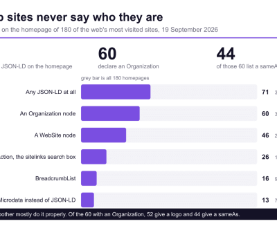
- Most Top Sites Never Say Who They Are in Structured Data October 14, 2026
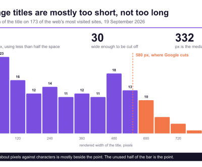
- Homepage Titles Are Mostly Too Short, Not Too Long October 8, 2026
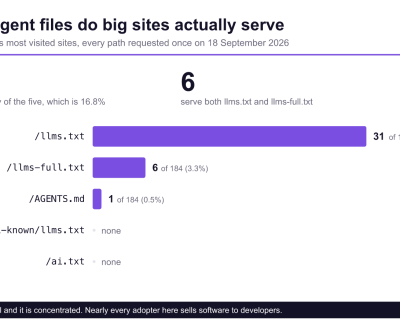
- Who Actually Serves an llms.txt? 184 Top Sites Measured September 29, 2026