

Google's Mobilegeddon. A case study showing the importance of having a mobile friendly website
- October 7, 2021
- Uncategorized
AI Summary
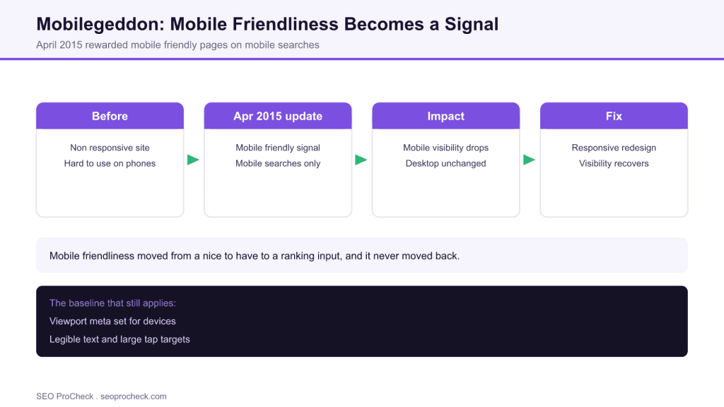
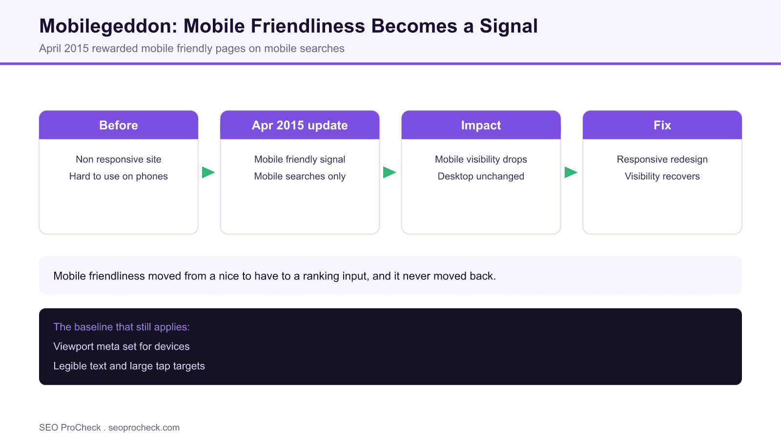
Mobilegeddon was Google's April 2015 update that made mobile friendliness a ranking signal for mobile searches. Sites without a responsive, mobile friendly design lost visibility in mobile results, and the durable fix, treating mobile as the primary experience, is still the baseline for mobile SEO today.
- The April 21, 2015 update rewarded pages that passed the mobile friendly test on mobile searches.
- It affected mobile results at the page level; desktop rankings were not changed by it.
- The fix then, responsive design with a proper viewport and larger tap targets, is still the baseline now.
- Google completed mobile first indexing by 2023, so the mobile version is the version it indexes.
This SEO case study documents a successful optimization initiative, providing actionable insights for practitioners. The documented approach demonstrates how strategic SEO implementation drives measurable results.
Initial Situation
Understanding the starting point is essential context for evaluating any case study. This documentation covers the initial challenges, competitive position, and business objectives that shaped the SEO strategy.
Strategy and Approach
The strategic approach combined multiple SEO disciplines to address identified opportunities. Key decisions around prioritization and resource allocation provide a template for similar initiatives.
Implementation
Moving from strategy to execution required specific technical implementations, content development, and process changes. This case study documents the practical steps that translated strategy into action.
Results and Learnings
The outcomes demonstrate effectiveness through measurable improvements in rankings, traffic, and business metrics. Analysis of successes and challenges provides learning value for practitioners.
Case studies like this contribute to the SEO knowledge base, helping practitioners learn from documented real-world experiences.
Source: https://www.scorchsoft.com/blog/mobilegeddon-mobile-friendly-case-study/
Practitioner Notes: Why Mobilegeddon Mattered
Mobilegeddon, which rolled out on April 21, 2015, was Google's first explicit use of mobile friendliness as a ranking signal for searches performed on mobile devices. The industry nickname oversold the immediate chaos, but the direction of travel it announced was real and permanent. Pages that passed the mobile friendly test earned an advantage on mobile results, and pages that failed slipped.
The criteria were concrete and remain a sensible checklist: a configured viewport so the page adapts to the device, legible text without pinch zooming, tap targets spaced far enough apart to use with a thumb, no horizontal scrolling, and no content that mobile browsers cannot play. The impact was scoped to mobile search results and applied at the page and query level, so a site could see some pages affected and others untouched. Crucially, desktop rankings were not changed by this update, which is a detail many retellings get wrong.
The durable lesson is to treat the mobile experience as the primary one rather than a shrunken afterthought of the desktop site. The remedy at the time, a responsive redesign with fluid layouts, a proper viewport meta tag, and comfortably sized tap targets, is still the baseline expectation today. If you are looking at mobile performance alongside crawling and indexing behavior, our crawling and indexing case studies put these signals in context.
It is also worth separating mobile friendliness from raw speed. Mobilegeddon judged usability on a small screen, not load time directly, although the two are related. Speed became its own story, and the payoff of fast mobile pages is visible in the Monetti AMP case study, where cutting mobile load time produced a measurable conversion lift.
What's Changed Since
Mobile friendliness is now table stakes rather than a differentiator. Google completed the move to mobile first indexing by 2023, which means the mobile version of your page is the version Google crawls, indexes and ranks, for desktop results too. A site that only looks good on desktop is now at a structural disadvantage everywhere, not just on phones.
The tooling has moved on as well. Google retired the standalone mobile friendly test tool, and the modern way to judge the mobile experience is through Lighthouse and the Core Web Vitals field metrics measured on mobile: Largest Contentful Paint, Cumulative Layout Shift, and Interaction to Next Paint. The binary mobile friendly label gave way to a broader Page Experience view, but the underlying instruction is unchanged: build one responsive site that is genuinely good to use on a phone.
Mobilegeddon 2015 versus Mobile SEO in 2026
| Topic | Mobilegeddon, 2015 | Mobile SEO in 2026 |
|---|---|---|
| Signal | Binary mobile friendly label | Page Experience and Core Web Vitals |
| Scope | Mobile search results only | Mobile first indexing for all results |
| Test tool | Mobile friendly test | Lighthouse and field vitals |
| Recommended build | Responsive design | Responsive design, still |
Frequently Asked Questions
What was Mobilegeddon?
Mobilegeddon was the nickname for Google's April 21, 2015 mobile friendly update. It made mobile friendliness a ranking signal for searches done on mobile devices, giving pages that passed the mobile friendly test an advantage in mobile results.
Does mobile friendliness affect rankings?
Yes. It began as a mobile only signal in 2015 and has since become fundamental through mobile first indexing, where Google uses the mobile version of your page to index and rank it. A poor mobile experience now hurts visibility across the board.
What is mobile first indexing?
Mobile first indexing means Google predominantly uses the mobile version of a page for indexing and ranking, including for desktop searches. Google completed this transition by 2023, so the mobile version is effectively the version that counts.
How do I test if my site is mobile friendly now?
The standalone mobile friendly test tool was retired, so use Lighthouse in Chrome and the Core Web Vitals report in Search Console, measured on mobile. Together they show usability and the field metrics that reflect real mobile experience.
Is responsive design still recommended?
Yes. Responsive design remains Google's recommended approach because it serves one HTML and URL that adapts to any screen, which simplifies crawling, indexing and maintenance compared with separate mobile and desktop sites.
Did Mobilegeddon affect desktop rankings?
No. The 2015 update applied only to mobile search results and did not change desktop rankings. The broader shift to mobile first indexing came later and is what now ties your mobile experience to results on every device.
Take this with you
The assistant links open with a question about this page already written. Nothing is sent until you press enter.
Claude Vincent is a technical SEO consultant focused on crawlability, rendering, and AI-search visibility. He writes the field guides and case studies at SEO ProCheck, with a bias toward the durable, unglamorous work that decides whether search engines and AI answer engines can actually read and cite a site.
About SEO ProCheck
Technical SEO consulting and GEO strategy with 20 years of enterprise experience. Case studies, resources, and tools for search and AI visibility.
Work With Me
Technical SEO audits, GEO strategy, site migrations, and international SEO. Hourly consulting for teams who need hands-on support, not just reports.
Subscribe to our newsletter!
Recent Posts
- Most Top Sites Never Say Who They Are in Structured Data October 14, 2026
- Homepage Titles Are Mostly Too Short, Not Too Long October 8, 2026
- Who Actually Serves an llms.txt? 184 Top Sites Measured September 29, 2026