

AI Summary
Poor mobile readability means text and controls that are technically present but painful to use on a phone: type under 16 pixels, tight line spacing, over long lines, and tap targets crowded together. Because Google indexes the mobile rendering of your page, the phone view is the version that gets evaluated, so readability problems are a page experience problem rather than a cosmetic one.
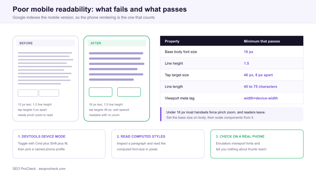
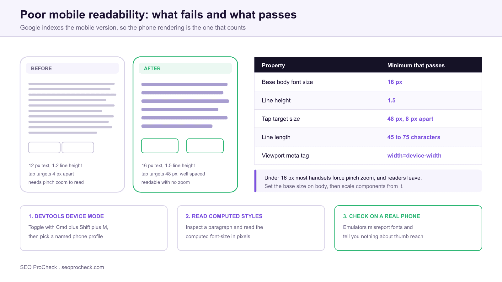
- Set the base body size to 16 px with a line height of about 1.5. Anything smaller invites pinch zoom.
- Tap targets should be about 48 px with at least 8 px of separation so a thumb cannot hit two at once.
- Keep line length between roughly 45 and 75 characters, which on a phone usually means the default single column.
- Confirm the page ships
<meta name="viewport" content="width=device-width, initial-scale=1">. Without it nothing else matters.
- Issue: Content is hard to read on mobile
- Impact: Poor mobile UX and engagement; mobile-first indexing penalty risk
- Fix: Fix font sizes, spacing, and tap targets for small screens
- Detection: Crawler, View Source, page-experience tools
What this issue means
On a phone, the page is a struggle: tiny fonts, cramped line spacing, text that requires zooming, or tap targets too close together. Since Google indexes the mobile version of your site, mobile readability is not optional.
What makes this issue slippery is that nothing is technically broken. The HTML is valid, the page returns a 200, the content is all present in the DOM, and every automated crawl passes. The failure is entirely in the rendering, and it only appears when a real person holds the page at arm's length on a bus. That is why readability problems survive for years on sites that otherwise run tight technical audits.
There is also a specific trap in how the problem is usually introduced. Almost nobody sets out to build a 12 pixel body font. It arrives through inheritance: a component library sets font-size: 0.8rem for a card, that card gets reused inside another component that already applied 0.9em, and the compounding produces text nobody chose. This is why the real fix is almost always at the base rather than in the component that looks wrong.
Why it matters
The majority of searches are mobile, and Google uses mobile-first indexing: the mobile experience is the experience it evaluates. Poor mobile readability raises bounce and weakens the engagement signals that correlate with rankings.
Two consequences follow that teams often miss. First, mobile-first indexing means content that is visually unusable on mobile is still the content being assessed for relevance, so there is no desktop version quietly saving you. Second, readability interacts with Core Web Vitals: pages with cramped tap targets generate mis taps, and a mis tap that triggers a heavy handler shows up in your INP measurements as a real interaction delay. The usability problem and the performance metric are not separate.
It is worth being precise about what Google does and does not do here. The old Mobile Usability report in Search Console, which explicitly flagged "text too small to read" and "clickable elements too close together," was retired in December 2023. Those checks are no longer surfaced as a standalone report, which is exactly why teams have stopped noticing the problem. The underlying signals still matter for the humans doing the reading, and page experience remains part of how Google assesses a result. The report went away, the issue did not.
How to detect it
You cannot eyeball this reliably, because your own reading distance and screen are unrepresentative. Measure it instead. Three checks catch nearly everything, in order of speed.
| Check | Exact path | What a failure looks like |
|---|---|---|
| Viewport tag present | View source, search for name="viewport" | Tag missing, or contains user-scalable=no |
| Computed font size | DevTools → Elements → Computed → font-size | Body copy computing under 16 px |
| Tap target spacing | Lighthouse → Accessibility and Best Practices sections | "Touch targets do not have sufficient size or spacing" |
| Line length | Device mode at 375 px wide, count characters per line | Over 75 characters, or a horizontal scrollbar |
| Horizontal overflow | Console: document.documentElement.scrollWidth | Value larger than window.innerWidth |
The last one is worth automating because horizontal overflow is the single most common cause of "the text is tiny" complaints. A page that overflows makes the browser zoom out to fit, shrinking everything at once. One rogue element does it: a wide table, an unbroken URL, a fixed width embed. This snippet in the console names the culprit immediately:
// paste into DevTools console at a 375 px viewport
[...document.querySelectorAll('*')]
  .filter(el => el.getBoundingClientRect().right > document.documentElement.clientWidth)
  .forEach(el => { el.style.outline = '2px solid magenta'; console.log(el); });
How to fix it
- Use a base font size of ~16px+ with comfortable line height (~1.5).
- Keep line length readable and paragraphs short on small screens.
- Space tap targets at least ~48px apart.
- Test on real devices and in Chrome's device emulator.
The implementation, concretely
Fix the base first, then stop overriding it. Most sites can resolve the bulk of this issue with a small set of rules applied globally rather than a per component audit.
html { font-size: 100%; }          /* respect the user's browser setting */

body {
  font-size: 1rem;                 /* 16px baseline, never smaller */
  line-height: 1.5;
  text-wrap: pretty;
}

p, li { max-width: 68ch; }         /* caps line length on wide screens */

/* fluid heading that never gets cramped on a phone */
h1 { font-size: clamp(1.75rem, 5vw, 2.5rem); line-height: 1.2; }

/* every interactive element gets a thumb sized hit area */
a, button, input, select, [role="button"] {
  min-height: 48px;
  min-block-size: 48px;
}

/* stop the wide element that causes zoom out */
img, video, table, pre { max-width: 100%; }
Three notes on the details. Setting html { font-size: 100% } rather than a pixel value preserves the reader's own browser text size preference, which matters more than any of the other rules for people who have already told their device they need larger text. The ch unit for max-width caps line length in characters rather than pixels, which is what the readability research actually measures. And min-height on interactive elements is more reliable than padding, because padding can be overridden by a component further down the cascade while a minimum height survives.
One anti pattern to remove wherever you find it: user-scalable=no or maximum-scale=1 in the viewport tag. It disables pinch zoom entirely, which turns a mild readability problem into an accessibility failure for anyone who needs to magnify. There is no good reason to keep it on a content page.
Where the problem usually comes from
| Root cause | Symptom on a phone | Fix |
|---|---|---|
Compounding em units | Text shrinks the deeper it is nested | Switch nested components to rem |
| Desktop first breakpoints | Phone inherits desktop sizing as the default | Write the mobile rule first, use min-width queries |
| A fixed width element | Whole page zooms out, all text tiny | Find it with the overflow snippet above |
| Dense navigation or filters | Adjacent links fire the wrong one | Increase spacing, or collapse into a menu |
| Light gray body text | Unreadable outdoors, fails contrast checks | Hold body copy at 4.5 to 1 contrast or better |
If this check flagged on your site, the two neighbouring checks worth running at the same time are font size too small for mobile and mobile viewport issues, since they share root causes with this one. For the wider context on why the phone rendering is the version that gets assessed, see mobile-first indexing.
FAQ
Anything under 16 pixels computed for body copy. Sixteen pixels is the point at which most people can read comfortably at normal holding distance without zooming, and it is also the default that browsers were designed around. Secondary text such as captions can drop to 14 px, but the main reading column should not.
Not as an isolated scored factor. It matters because Google indexes and evaluates the mobile rendering of your page, so unusable mobile content is the content being judged, and because readability drives the engagement behaviour that correlates with performance. Treat it as a conversion and retention issue that also protects your search visibility.
Google retired it in December 2023, along with the mobile friendly test tool, on the reasoning that the mobile web had matured and the report was no longer the most useful signal to surface. The checks it performed still describe real problems, so you now have to run them yourself with Lighthouse and DevTools rather than waiting for a report to flag them.
Around 48 pixels in each direction, with at least 8 pixels of clear space between neighbouring targets. That figure comes from the average size of an adult fingertip on a touchscreen. Setting a min-height on links and buttons is more reliable than adding padding, because padding is easier for another rule to override.
Something on the page is wider than the viewport, so the browser zooms the whole page out to fit and shrinks every element proportionally. Usually it is a wide table, an unbroken URL, or a fixed width embed. Run the overflow detection snippet in the console at a 375 pixel viewport to identify the exact element.
It is good enough for layout, overflow, and computed styles, which is most of this checklist. It cannot tell you how the type actually reads at arm's length, how the page behaves under a real thumb, or how it looks in daylight. Do the fast pass in the emulator, then confirm on one real handset before signing the work off.
Want a full technical + page-experience audit?
These checks are part of every audit I run. See how an advanced SEO audit works →
Claude Vincent is a technical SEO consultant focused on crawlability, rendering, and AI-search visibility. He writes the field guides and case studies at SEO ProCheck, with a bias toward the durable, unglamorous work that decides whether search engines and AI answer engines can actually read and cite a site.
About SEO ProCheck
Technical SEO consulting and GEO strategy with 20 years of enterprise experience. Case studies, resources, and tools for search and AI visibility.
Work With Me
Technical SEO audits, GEO strategy, site migrations, and international SEO. Hourly consulting for teams who need hands-on support, not just reports.
Subscribe to our newsletter!


Recent Posts
- Can AI Crawlers Actually Read Your Site? I Measured 400 of the Biggest September 5, 2026
- The Pre-Publish Quality Gate for AI-Assisted Content August 6, 2026
- AGENTS.md vs llms.txt vs llms-full.txt: Which Agent File Does What July 18, 2026