

AI Summary
Mobile and desktop return measurably different results for the same query, mostly because the SERP features differ and mobile weights local intent far more heavily. Since Google moved to mobile-first indexing, the mobile rendering of your page is what gets indexed and ranked for both device types, so device differences are a reporting and prioritisation problem rather than two separate optimisation projects.
- Most ranking gaps between devices are small, one to three positions. The dramatic ones cluster in local intent queries.
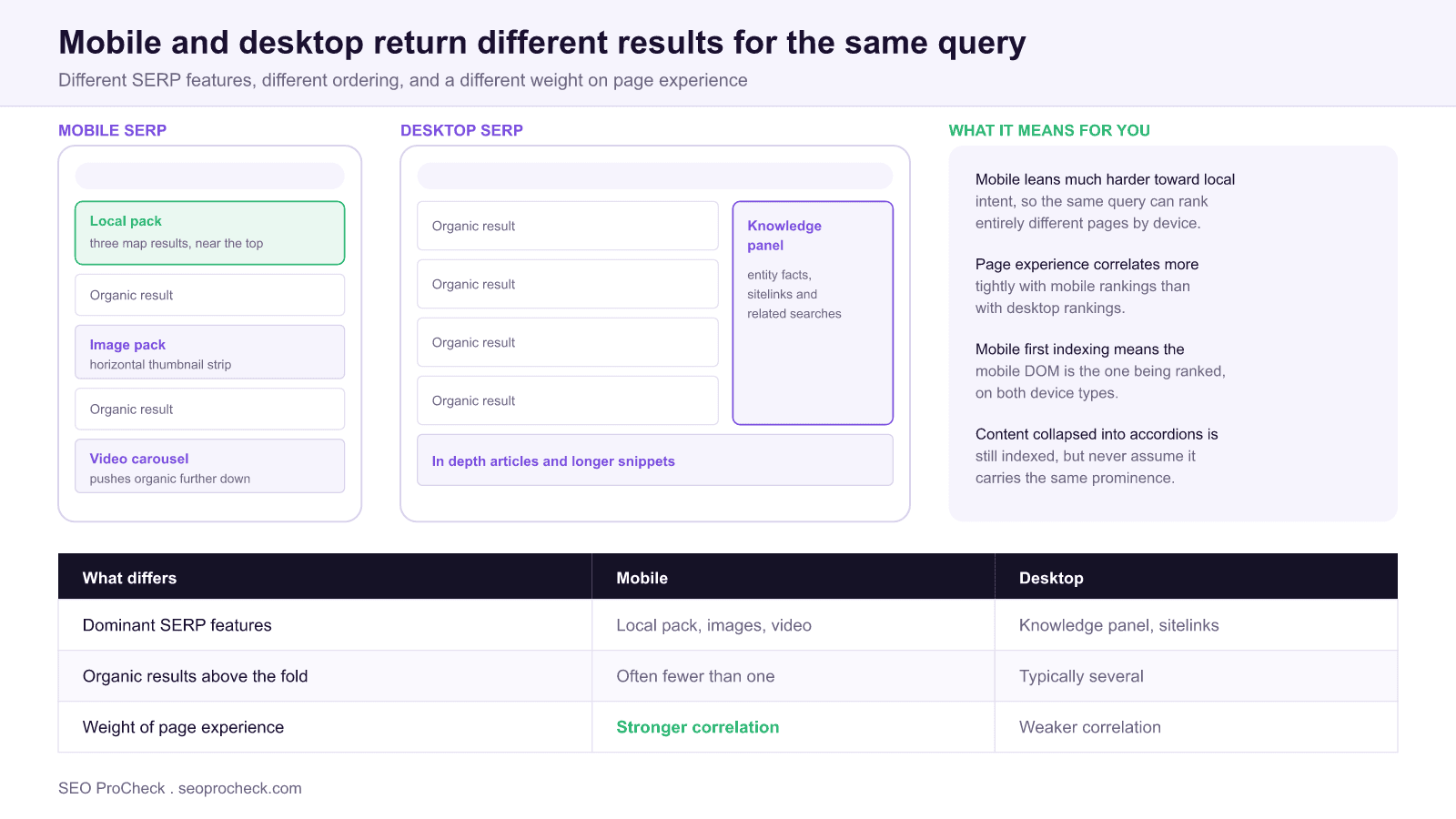
- Mobile SERPs favour local packs, image packs and video carousels; desktop shows more knowledge panels and more organic results above the fold.
- Segment every report by device. A blended average hides the device where the problem lives.
- Whatever your mobile DOM omits is effectively omitted from ranking consideration, including on desktop.
Research comparing mobile and desktop search results revealed significant differences in how Google ranks content across devices. The study has implications for prioritizing mobile optimization in a mobile-first indexing world.
Ranking Position Differences
Approximately 80% of keywords showed different rankings between mobile and desktop. While most differences were minor (1-3 positions), some queries showed dramatic variation. Local queries showed the largest mobile vs desktop ranking differences, with mobile heavily favoring local results.
The distribution matters more than the headline. A one to three position difference on most keywords is largely noise from a practitioner's point of view: it will not change your strategy, and chasing it wastes time. The tail is where the decisions are. When a query moves five or ten positions between devices, there is almost always a structural reason, and it is usually one of three.
The first is local intent, which is the dominant cause. Google interprets many queries as implicitly local on mobile that it treats as informational on desktop, because a phone user searching "plumber" or "coffee" is far more likely to want somewhere to go than something to read. The result is not a reshuffle of the same ten pages, it is a different set of pages entirely, with directory and map results displacing national content.
The second is feature displacement. If a mobile SERP carries a local pack, an image pack and a video carousel above the first organic result, then position 3 on mobile is functionally invisible while position 3 on desktop sits comfortably on screen. The ranking is identical; the visibility is not. This is why rank tracking that reports only the number is misleading, and why pixel depth is the more honest measure on mobile.
The third is a genuine parity problem on your own site: content, links, or structured data present on desktop and missing on mobile. That one is your fault and it is fixable, which makes it the first thing to rule out.
SERP Feature Variation
Mobile SERPs displayed different feature combinations than desktop. Mobile showed more image packs, local packs, and video carousels. Desktop showed more knowledge panels and in-depth articles. Understanding device-specific SERP layouts helps target appropriate features for each device.
Turning that into a targeting decision
Feature variation is only useful if it changes what you build. The practical translation is that the asset you need to compete depends on which device carries your demand, and that is knowable from your own data rather than from general advice.
| If your demand is mostly here | The feature that matters | What you actually have to build |
|---|---|---|
| Mobile, local intent | Local pack | A complete Business Profile, consistent citations, review velocity |
| Mobile, visual or product | Image pack | Original images, descriptive filenames and alt text, ImageObject markup |
| Mobile, how to queries | Video carousel | A short demonstration video with chapters and a transcript |
| Desktop, entity or brand | Knowledge panel | Organization markup, sameAs links, consistent naming across the web |
| Desktop, research queries | Longer snippets, sitelinks | Depth, clear heading structure, a coherent internal link hierarchy |
Find out which row applies to you before acting on any of it. In Search Console, open Performance, add a Device filter, and compare the query sets rather than the totals. A B2B software site with 80 percent desktop demand should not be prioritising image packs, and a service business with 80 percent mobile demand should not be spending its quarter on knowledge panel signals. The SERP features reference covers what each feature requires in more detail.
Page Experience Matters More on Mobile
Core Web Vitals and page speed showed stronger correlation with mobile rankings than desktop. This aligns with user expectations: mobile users on potentially slower connections are more sensitive to performance issues. Mobile-specific UX factors like tap target size may also influence mobile-specific rankings.
Two things are worth separating here, because they get conflated constantly. Google evaluates Core Web Vitals separately for mobile and desktop, so a site can pass on one and fail on the other, and Search Console reports them as two distinct URL group sets. That is a measurement fact rather than a claim about ranking weight. The correlation observed on mobile is unsurprising given the underlying hardware: the same JavaScript bundle that a desktop CPU absorbs without complaint will produce long tasks on a mid range phone, so mobile is simply where performance problems become visible first.
The practical consequence is that mobile is where you diagnose. Throttle to a mid tier device profile with 4x CPU slowdown before you conclude anything about performance, because an unthrottled desktop test will report a healthy page that real users experience as broken. If your mobile Core Web Vitals group is failing, the mobile CWV failing check walks through the usual causes in order.
Content Display Considerations
Mobile-first indexing means Google primarily uses mobile versions for ranking decisions. Sites with different mobile and desktop content need to ensure mobile versions contain complete content. Hiding content behind accordions or tabs on mobile can affect indexing and rankings.
Verifying parity, concretely
Content parity is the single highest value check in this whole topic, because a failure here silently caps your ceiling on both devices. The mechanism is simple: if it is not in the mobile rendering, it effectively does not exist for ranking purposes. Run these four checks on your main templates.
| Check | How to run it | Failure signature |
|---|---|---|
| Rendered body text | URL Inspection → Test Live URL → View Tested Page → HTML | Mobile rendering shorter than the desktop version |
| Structured data | Rich Results Test, run once per user agent | Markup present on desktop only |
| Internal links | Crawl twice, once with a smartphone user agent | Fewer outlinks from the mobile crawl |
| Meta and headings | Compare title, description and H1 across both crawls | Truncated or entirely different values on mobile |
On accordions and tabs specifically, the guidance is more settled than the anxiety around it suggests. Content inside a collapsed accordion that is present in the HTML is indexed normally, and using accordions to make a long page usable on a phone is good design rather than a risk. What does cause problems is content that is not in the DOM until a user interacts, because a tap that triggers a fetch is an interaction Googlebot does not perform. The distinction is loaded but hidden, which is fine, versus not loaded at all, which is not.
For a step by step verification routine covering the whole parity question, see mobile-first indexing verification. Broader questions are collected in the mobile SEO FAQ.
FAQ
Mostly because the two result pages are built differently. Mobile SERPs carry more local packs, image packs and video carousels, which displaces organic listings, and Google reads local intent into mobile queries far more readily. Small gaps of one to three positions are normal; large gaps usually indicate a local intent query or a content parity problem on your own site.
No. Since mobile-first indexing, Google indexes the mobile rendering and uses it to rank for both devices, so there is one index to optimise for. What does differ by device is prioritisation: which SERP features are worth targeting, and which performance problems to fix first. Segment your reporting by device, but keep one site.
Not if the content is in the HTML when the page loads. Collapsed content that is present in the DOM is indexed normally, and accordions are a reasonable way to make long pages usable on a phone. The real risk is content that only loads after a tap, because Googlebot does not click, so anything fetched on interaction may never be seen.
Use URL Inspection in Search Console, choose Test Live URL, then open View Tested Page and read the rendered HTML. That is the smartphone Googlebot rendering, which is the version that gets indexed. Compare its length and its links against your desktop view, and investigate any element that is missing.
Yes. Search Console reports mobile and desktop as separate URL group sets, and a site can pass on one while failing on the other. Because mobile hardware is slower, performance problems surface there first, so diagnose with CPU throttling on a mid tier device profile rather than on your own machine.
Whichever carries your demand, which you can read from the Device filter in the Search Console Performance report. Track both if you can, and treat a blended figure with suspicion because it averages away the device where the problem lives. On mobile, also consider pixel depth rather than position alone, since features can push a strong ranking below the fold.
Source: Multiple mobile SEO studies compiled
Take this with you
The assistant links open with a question about this page already written. Nothing is sent until you press enter.
Claude Vincent is a technical SEO consultant focused on crawlability, rendering, and AI-search visibility. He writes the field guides and case studies at SEO ProCheck, with a bias toward the durable, unglamorous work that decides whether search engines and AI answer engines can actually read and cite a site.
About SEO ProCheck
Technical SEO consulting and GEO strategy with 20 years of enterprise experience. Case studies, resources, and tools for search and AI visibility.
Work With Me
Technical SEO audits, GEO strategy, site migrations, and international SEO. Hourly consulting for teams who need hands-on support, not just reports.
Subscribe to our newsletter!



Recent Posts
- Most Top Sites Never Say Who They Are in Structured Data October 14, 2026
- Homepage Titles Are Mostly Too Short, Not Too Long October 8, 2026
- Who Actually Serves an llms.txt? 184 Top Sites Measured September 29, 2026