


What "Missing Viewport Meta Tag" Means
This check fires when a page's <head> has no <meta name="viewport"> tag. Without it, mobile browsers assume a desktop-width canvas (usually 980px) and shrink the whole page to fit, so your visitors land on a zoomed-out wall of tiny text they have to pinch and drag to read.
The stakes are simple: Google indexes the mobile version of your site first, and a page that renders as a shrunk-down desktop layout is a page Google can flag as not mobile-friendly. That hurts how you show up in mobile results, and it tanks the experience for the majority of your traffic that arrives on a phone.
The Failing Example and the Fix
Here is what a broken <head> looks like. There is simply no viewport line at all:
<!DOCTYPE html>
<html lang="en">
<head>
  <meta charset="utf-8">
  <title>Handmade Leather Bags</title>
  <link rel="stylesheet" href="/style.css">
</head>
The fix is one line. Drop this into the <head>, ideally near the top right after the charset declaration:
<meta name="viewport" content="width=device-width, initial-scale=1">That is the whole correct tag. width=device-width tells the browser to match the layout width to the actual device screen, and initial-scale=1 sets the starting zoom to 100% so nothing is shrunk on load. Do not add maximum-scale=1 or user-scalable=no chasing a "cleaner" look, because that breaks pinch-zoom and creates an accessibility failure. If you want the reasoning on that, see zooming and scaling must not be disabled.
Viewport Tag: Common Values Decoded
| Property | Recommended value | What it does | Skip it when |
|---|---|---|---|
width | device-width | Matches layout width to the device screen | Never omit this |
initial-scale | 1 | Sets load zoom to 100% | Rarely a reason to drop it |
maximum-scale | (leave unset) | Caps how far users can zoom in | Almost always leave unset |
user-scalable | (leave unset / yes) | Allows pinch-zoom | Never set to no |
minimum-scale | (leave unset) | Floors how far users can zoom out | Setting it is usually a mistake, see viewport minimum-scale set |
How to Detect It
- View Source. Open the page, hit Ctrl+U (Cmd+Option+U on Safari), and search the source for
name="viewport". Nothing found means the tag is missing. Fast for a single URL. - curl. Pull the raw HTML and grep for it:
curl -s https://example.com/page/ | grep -i viewport. Empty output confirms the tag never shipped. This checks the server response before any JavaScript runs, which is exactly what a crawler sees first. - Screaming Frog. Crawl the site, then look at the internal HTML report. If a page has no viewport, it will not report a mobile-friendly meta, and you can build a custom extraction for
meta[name=viewport]to list every URL missing it in one export. - GSC URL Inspection. Inspect the URL in Google Search Console, run "Test Live URL," and open the rendered screenshot. A page missing the viewport tag renders zoomed-out and cramped, which is the visual tell.
How to Fix It
- Locate the template that builds your
<head>. On WordPress that is usuallyheader.phpor the theme's head hook; on most frameworks it is a shared layout or base template. - Add the exact line
<meta name="viewport" content="width=device-width, initial-scale=1">inside the<head>. - Confirm it appears once per page, not zero times and not duplicated. A duplicated viewport tag causes its own conflicts.
- Because it lives in a shared template, one edit fixes every page that uses it. Deploy, then re-crawl to confirm the flag clears sitewide.
- Sanity-check the layout on a real phone or a resized browser. If content still overflows sideways, the viewport tag is now correct but your CSS has a fixed-width element to hunt down. See content exceeds viewport.
Why the Default 980px Assumption Wrecks the Page
When a mobile browser finds no viewport tag, it does not throw an error. It quietly assumes a "desktop" layout viewport, historically 980px on Safari and similar on others, then scales that entire rendered page down to fit the physical screen. The result is a page that is technically "displayed" but at maybe 30% size: 8-point body text, buttons too small to tap, and horizontal scrolling to read a single line.
This matters for indexing, not just eyeballs. Under mobile-first indexing Google crawls and evaluates the mobile rendering. A page it renders as a shrunken desktop layout is a page it can classify as delivering a poor mobile experience, which is a signal you do not want attached to content you are trying to rank. It also cascades: analytics show inflated bounce and short dwell time, because real people bail on a page they have to pinch to read. Fixing the one-line tag is the highest-leverage mobile fix there is, and it is why page is not mobile friendly so often traces back to a missing or malformed viewport.
Frequently Asked Questions
Does a missing viewport tag directly hurt my Google rankings?
Not as a standalone ranking penalty, but it makes the page fail mobile-friendliness, and mobile usability feeds into how Google treats the page under mobile-first indexing. The bigger hit is behavioral: people bounce off a zoomed-out page fast, and that is real lost traffic.
My site is responsive. Do I still need the viewport tag?
Yes, and this trips people up. Responsive CSS with media queries only kicks in correctly once the browser knows the real device width. Without the viewport tag, the browser assumes ~980px, your media queries never match a phone screen, and the "responsive" design renders as a shrunk desktop layout anyway.
Where exactly in the head should the tag go?
Anywhere inside <head> works, but put it high, right after <meta charset>. The browser reads the head top-down, and you want the viewport rule established before it starts laying out content.
What is the difference between this and "viewport missing width"?
This check means there is no viewport tag at all. Viewport missing width means the tag exists but left out width=device-width, which is nearly as broken. Both end in the same shrunk-down result.
Is width=device-width, initial-scale=1 enough, or do I need more properties?
Those two are the complete, correct answer for almost every site. Adding scale locks or disabling user zoom does more harm than good. Keep it to those two properties unless you have a very specific, tested reason not to.
Take this with you
The assistant links open with a question about this page already written. Nothing is sent until you press enter.
Claude Vincent is a technical SEO consultant focused on crawlability, rendering, and AI-search visibility. He writes the field guides and case studies at SEO ProCheck, with a bias toward the durable, unglamorous work that decides whether search engines and AI answer engines can actually read and cite a site.
About SEO ProCheck
Technical SEO consulting and GEO strategy with 20 years of enterprise experience. Case studies, resources, and tools for search and AI visibility.
Work With Me
Technical SEO audits, GEO strategy, site migrations, and international SEO. Hourly consulting for teams who need hands-on support, not just reports.
Subscribe to our newsletter!



Recent Posts
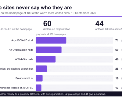
- Most Top Sites Never Say Who They Are in Structured Data October 14, 2026
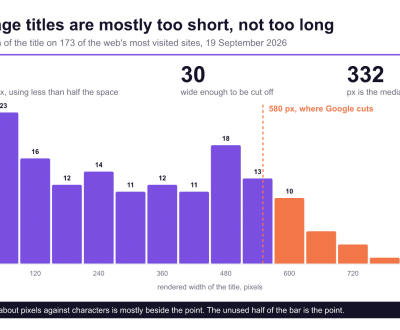
- Homepage Titles Are Mostly Too Short, Not Too Long October 8, 2026
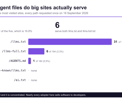
- Who Actually Serves an llms.txt? 184 Top Sites Measured September 29, 2026