


width=device-width tells the browser nothing about how to size the layout on a phone, so mobile users get a zoomed-out desktop page. Add <meta name="viewport" content="width=device-width, initial-scale=1"> and the problem is gone.Element code HT-018. I have lost count of the sites where this one line was missing and the "mobile problem" everyone was chasing evaporated the moment we added it. The viewport meta tag is the single instruction that connects your responsive CSS to the actual screen. Leave the width out and every media query you wrote is talking to the wrong number.
What the viewport tag actually does
Mobile browsers ship with a "layout viewport" that is wider than the physical screen, historically around 980px. This was a hack from the early smartphone era so that old desktop-only sites would render in full and let the user pinch to zoom. When you set width=device-width, you override that fake width and tell the browser to make the layout viewport match the device's own CSS pixel width. That is the number your media queries read. Without it, a @media (max-width:600px) rule never fires on a 390px iPhone, because the browser thinks it is painting onto a 980px canvas.
The initial-scale=1 part sets the zoom level to 1:1 on first paint so the page is not pre-zoomed. The two together are the baseline every responsive site needs.
Before and after
Why this matters for SEO
Google indexes with a mobile-first crawler. The page it evaluates for ranking is the mobile render, and a page that shows a zoomed-out desktop layout on mobile fails the "mobile friendly" bar. Search Console used to flag this in its Mobile Usability report as "viewport not set" or "content wider than screen," but Google retired that report on December 1, 2023 and has since removed the Page Experience report as well, so Lighthouse, PageSpeed Insights or Chrome DevTools device mode now show it. Beyond the label, the real cost is behavioral: users land, see 8-point text, bounce, and that pogo-sticking feeds back into how the query performs. You are not just missing a checkbox, you are shipping a page nobody can read on the device most of your traffic uses.
Viewport values you will run into
| Content value | What it does | Verdict |
|---|---|---|
width=device-width, initial-scale=1 | Matches layout to device, no pre-zoom | Use this |
initial-scale=1 only | Sets zoom but leaves layout width guessing | Incomplete |
width=1024 | Forces a fixed desktop width on all devices | Avoid |
user-scalable=no | Blocks pinch zoom, an accessibility failure | Do not add |
| No viewport tag at all | Falls back to the 980px desktop hack | The bug |
How to detect it
Run a Screaming Frog crawl and look at the page's head, or add a custom extraction for meta[name=viewport] to flag pages missing the width token across the whole site. Google Search Console no longer has a Page Experience or Mobile Usability report, but the URL Inspection live test screenshot shows how Google renders a real indexed URL on mobile, and Lighthouse flags a missing viewport. Sitebulb reports it directly in its mobile hints. For a one-off, open Chrome DevTools, toggle the device toolbar, and view source: if width=device-width is not in the head, you found it. Server-side rendered and templated sites usually have this in one shared layout file, so a single fix can clear thousands of URLs at once.
How to fix it, step by step
- Open the shared header or base template that renders inside every page's
<head>. - Add
<meta name="viewport" content="width=device-width, initial-scale=1">as high in the head as practical, ideally right after the charset tag. - Do not add
maximum-scaleoruser-scalable=no. Locking zoom breaks accessibility and Google flags it. - Confirm your CSS actually uses relative units and media queries. The tag exposes the correct width, but your layout still has to respond to it.
- Redeploy and re-crawl to confirm the tag is present on rendered HTML, not just in a JS bundle that ships late.
- Ship
width=device-width, initial-scale=1on every page - Put the tag in a shared layout so it cannot drift
- Pair it with real responsive CSS and fluid images
- Verify on the rendered HTML, not just source
- Test on an actual mid-range phone, not only DevTools
- Hardcode a fixed pixel width like
width=1024 - Disable zoom with
user-scalable=no - Rely on JavaScript to inject the tag after load
- Assume a theme includes it, check every template
- Set
initial-scaleabove 1 and pre-zoom users in
What good looks like
One viewport tag, present in the rendered head of every URL, reading width=device-width, initial-scale=1, with no scale locks. Search Console shows zero viewport flags, the mobile render matches the desktop content, and text is readable and tappable without pinching. That is the whole target. This is the cheapest high-impact fix in technical SEO, so there is no reason to leave it broken.
FAQ
Does the viewport tag alone make my site responsive?
Is it OK to set initial-scale without width?
width=device-width the layout viewport can still default to the legacy desktop width, so your media queries may not fire correctly. Always set both.Why is user-scalable=no a problem?
Where exactly should the tag go?
<head>, high up, typically right after the charset meta. It must be in the server-rendered HTML so the browser reads it before layout, not injected late by script.Viewport misconfigurations usually travel with a stack of other mobile and head-level issues. An audit finds them all in one pass.
Take this with you
The assistant links open with a question about this page already written. Nothing is sent until you press enter.
Claude Vincent is a technical SEO consultant focused on crawlability, rendering, and AI-search visibility. He writes the field guides and case studies at SEO ProCheck, with a bias toward the durable, unglamorous work that decides whether search engines and AI answer engines can actually read and cite a site.
About SEO ProCheck
Technical SEO consulting and GEO strategy with 20 years of enterprise experience. Case studies, resources, and tools for search and AI visibility.
Work With Me
Technical SEO audits, GEO strategy, site migrations, and international SEO. Hourly consulting for teams who need hands-on support, not just reports.
Subscribe to our newsletter!



Recent Posts
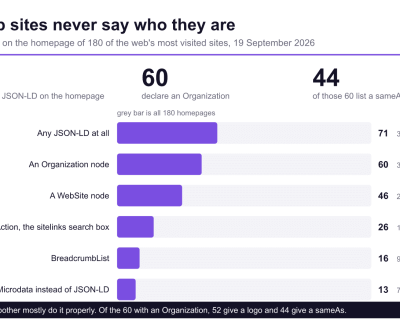
- Most Top Sites Never Say Who They Are in Structured Data October 14, 2026
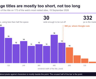
- Homepage Titles Are Mostly Too Short, Not Too Long October 8, 2026
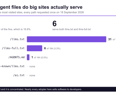
- Who Actually Serves an llms.txt? 184 Top Sites Measured September 29, 2026