

Bringing Content Out of Tabs: SEO Split Testing Lessons from SearchPilot
- July 10, 2020
- Content
AI Summary
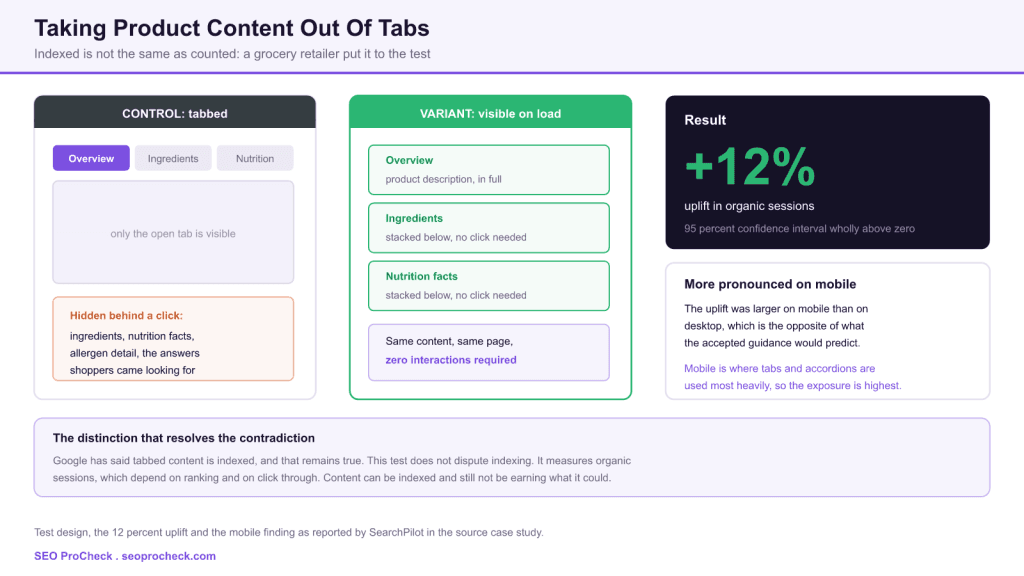
Iceland Groceries ran a controlled SEO split test taking product information such as ingredients and nutrition facts out of tabs and accordions and making it visible on page load. The variant produced a 12 percent uplift in organic sessions with a 95 percent confidence interval wholly above zero, and the improvement was even more prominent on mobile than on desktop, which runs against the guidance most teams have been working from.
- The content was identical in both versions. The only change was whether an interaction was required to see it.
- Result: a 12 percent uplift in organic sessions, with the 95 percent confidence interval entirely above zero.
- The effect was stronger on mobile, where tabs and accordions are typically used most aggressively.
- This does not contradict Google's position that tabbed content is indexed. Indexed and fully counted are different claims.
For years the settled answer to whether tabbed content hurts SEO has been no, Google indexes it, move on. That answer was correct and also incomplete, because it addressed indexing when the question people were actually asking was about performance. This test measured performance directly and found 12 percent sitting behind a click. If you have been using the indexing answer to close down this discussion, it is worth reopening.
The tabbed product page is close to a design default. It keeps the template tidy, it satisfies the stakeholder who wants the page to feel uncluttered, and it has an SEO defence ready to hand whenever anyone questions it. That defence has been repeated so often that it stopped being examined, which is usually the point at which testing something becomes worthwhile.
The test
The hypothesis was that making product information visible on page load, rather than concealing it behind tabs and accordions, would improve organic search performance. The content moved into view included product details such as ingredients and nutrition facts.
The setup compared a control group of product pages with tabs and accordions concealing the information against a variant group where the same content was visible on initial page load, and the test ran across both desktop and mobile versions. Crucially the content itself was unchanged. This is not a test of whether more information helps, it is a test of whether requiring a click to reach the same information costs anything.
Mechanically, the change is small. A tab interface conditionally displays one panel and hides the others. The variant simply stops hiding them:
/* control: only the active panel is displayed */
.tab-panel            { display: none; }
.tab-panel.is-active  { display: block; }

/* variant: every panel rendered in sequence, headings restored */
.tab-panel            { display: block; margin-bottom: 2rem; }
.tab-list             { display: none; }
The detail that matters and gets missed: when you unstack tabs, the tab labels have to become real headings. A tab labelled Ingredients is a button. Once the panel is always visible, that label needs to be an h2 or h3 so the section is structurally identifiable rather than a wall of unlabelled text.
The result
The variant achieved a 12 percent uplift in organic sessions, with the 95 percent confidence interval wholly above the horizontal axis. That last clause is the part worth noting, because it is the statistical statement that makes the result actionable: the entire plausible range of the effect sits above zero, so the finding is not a favourable reading of a noisy result.
The improvement was even more prominent on mobile than on desktop. The source frames this as challenging Google's previous guidance that tabbed content should not negatively impact mobile SEO, and it is the more surprising half of the finding. Mobile was supposed to be the case where hiding content was explicitly sanctioned.
Our reading of why mobile responded more strongly is prosaic and is inference rather than a reported finding: mobile templates hide more. Screen constraints push teams to collapse far more of the page on mobile than on desktop, so the mobile variant revealed a larger share of the page's content. A bigger change produced a bigger effect.
Reconciling this with what Google has said
The source references Gary Illyes asserting in 2018 that indexing and ranking are not limited by content concealed behind tabs. That statement and this test result are both defensible, because they are answers to different questions.
| Claim | Who makes it | What it is actually about | Compatible with the other? |
|---|---|---|---|
| Content in tabs is indexed | Google, repeatedly since 2018 | Whether the crawler retrieves and stores the text at all | Yes. This test does not test indexing |
| Content in tabs is not weighted down for ranking | Whether the ranking systems discount hidden text | Yes, though this is the claim under most pressure from the result | |
| Revealing tabbed content increased organic sessions 12 percent | This split test | An outcome that combines ranking, click through and page performance | Yes. Sessions can rise without any change in how the text is weighted |
| Therefore hidden content is penalised | Nobody credible | A misreading | No. Do not draw this conclusion from this study |
Claim comparison is SEO ProCheck commentary. The source reports the test result and references the Google guidance it sits against.
Organic sessions is a compound metric. It moves when rankings move, when click through rate moves, and when the pages that rank become more likely to satisfy the query. A page that surfaces its ingredients list to a crawler and to an AI answer system without requiring an interaction can earn visibility for long tail queries that a tabbed page never surfaces for, without anything being penalised anywhere. That is the most parsimonious explanation and it requires no conflict with Google's position.
Deciding what to unstack
The finding does not license removing every progressive disclosure component on the site. What it licenses is applying a test to each one. The question is whether the content behind the interaction is content people came for, or content a minority occasionally need.
| Content type | Example | Do people search for this? | Recommendation |
|---|---|---|---|
| Purchase deciding attributes | Ingredients, allergens, nutrition, dimensions, materials, compatibility | Yes, frequently and specifically | Show on load. This is the category the test covered |
| Sizing and fit guidance | Size charts, fit notes, conversion tables | Yes, and it drives returns as well as traffic | Show on load, or at minimum the summary with detail expandable |
| Delivery and returns policy | Standard site-wide terms repeated on every product | Rarely at the product level | Leave collapsed. Duplicated across every page and adds nothing unique |
| Full technical specification tables | Forty rows of engineering detail | Sometimes, for a minority of buyers | Show the top rows, collapse the remainder. A reasonable middle position |
| Reviews | Customer review text | Yes, and it is unique content by definition | Show at least the first few on load rather than lazy loading all of them |
Prioritisation framework is SEO ProCheck commentary, applied to the category of content the source case study tested.
The delivery and returns row is the useful counterexample. It is identical across every product page on the site, so revealing it adds duplicated boilerplate to thousands of URLs and dilutes rather than strengthens each one. The principle is not visibility for its own sake, it is visibility for content that is specific to that page.
Implementing this without breaking the page
- Convert tab labels into real headings. A button becomes an
h2. Without this you have traded an organised page for a long undifferentiated one, and the structure was doing genuine work. - Add a jump link menu where tabs used to be. Anchor links to each section preserve the navigation benefit while leaving all the content present in the document.
- Watch Cumulative Layout Shift. Sections that were previously collapsed now occupy real height. If they render after initial paint you will introduce shift, so reserve the space.
- Check Interaction to Next Paint too. Removing the tab component removes JavaScript and event handlers, which usually improves this metric. It is a secondary benefit worth measuring.
- Do not lazy load the newly visible content. Replacing a click with a scroll trigger reproduces the original problem in a form that is harder to notice.
- Roll out to a subset first. Even without split testing infrastructure, changing one product category and holding the rest constant gives you a comparison group.
Our ecommerce product page SEO guide covers the wider template checklist this sits within, and the Product schema guide covers marking up the attributes you are about to reveal, since structured data and visible content should agree with one another.
What has changed since this test
The argument has moved on in a way that strengthens the finding considerably, and it is worth separating what the test established from what has developed since.
The largest change is the arrival of AI generated answers and the retrieval systems that feed them. Those systems extract from the content of a page, and several of the crawlers behind them execute little or no JavaScript. Content that exists only after a user interaction is at a structural disadvantage there in a way that goes beyond ranking, because it may not be retrieved as a candidate answer at all. For a query like whether a product contains a particular allergen, the page that states it plainly in the document is the page that gets cited. Our research on what the raw HTML still does covers the mechanics.
The second change is Interaction to Next Paint, which replaced First Input Delay as a Core Web Vitals metric in March 2024. Tab and accordion components are interactive by definition, and on heavy product templates they are a recurring source of interaction latency. Removing them now improves a metric Google measures directly, which was not part of the calculation when this pattern became conventional.
What has not changed is Google's position on indexing, and it is worth restating so nobody overcorrects. Tabbed content is still indexed. This test never claimed otherwise. The finding is that indexed content sitting behind an interaction was worth 12 percent less in organic sessions than the same content shown plainly, and everything that has happened since points in the same direction. For the related question of whether the content is worth having at all, our write up of the split test on unique content approaches it from the opposite end.
FAQ
Google has consistently said that content behind tabs is indexed, and this test does not contradict that. What it shows is that indexed is not the same as fully counted: making product information visible on load delivered a reported 12 percent uplift in organic sessions compared with the same content behind tabs. Indexing and performance are separate questions.
Not automatically, but the burden of proof has shifted. If you use tabs to hide content that shoppers genuinely want, such as ingredients, sizing or specifications, this test suggests you are paying for that tidiness. If you use them to organise a genuinely large volume of technical detail that most visitors never need, the case is weaker. Test it on your own templates.
The source reports the effect as even more prominent on mobile without establishing a cause. The most likely explanation is exposure: tabs and accordions are used far more aggressively on mobile because screen space is scarce, so mobile templates typically hide a much larger share of their content and therefore have more to gain from revealing it.
Yes. The source references Gary Illyes stating in 2018 that indexing and ranking are not limited by content concealed behind tabs. That statement was about how the content is processed. This test measures organic sessions, an outcome that also depends on how the page performs for users once it ranks, so both things can be true simultaneously.
Length is not the problem people think it is, provided the page is structured. Use real headings for each section so the page remains scannable, and consider a jump link menu at the top rather than a set of tabs. That gives you the navigability tabs offer without requiring an interaction before the content exists on screen.
It splits pages rather than users, because search engines cannot be shown two versions of the same URL. Comparable pages are randomly assigned to control and variant groups, the change ships to the variant group only, and a model forecasts what those pages would have done unchanged. The result is the deviation from that forecast, reported with a confidence interval.
How much of your product page content requires a click to exist?
An audit measures what is present in your raw HTML against what a shopper sees on load, and identifies where the gap is costing you.
Claude Vincent is a technical SEO consultant focused on crawlability, rendering, and AI-search visibility. He writes the field guides and case studies at SEO ProCheck, with a bias toward the durable, unglamorous work that decides whether search engines and AI answer engines can actually read and cite a site.
About SEO ProCheck
Technical SEO consulting and GEO strategy with 20 years of enterprise experience. Case studies, resources, and tools for search and AI visibility.
Work With Me
Technical SEO audits, GEO strategy, site migrations, and international SEO. Hourly consulting for teams who need hands-on support, not just reports.
Subscribe to our newsletter!

Recent Posts
- Can AI Crawlers Actually Read Your Site? I Measured 400 of the Biggest September 5, 2026
- The Pre-Publish Quality Gate for AI-Assisted Content August 6, 2026
- AGENTS.md vs llms.txt vs llms-full.txt: Which Agent File Does What July 18, 2026