

AI Summary
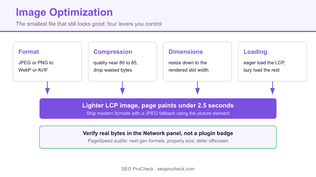
Image optimization means serving every image in the smallest file that still looks good, using the right format, dimensions, compression, and loading moment. It matters because the largest above the fold image is usually your Largest Contentful Paint element, so a bloated hero can push a page past the 2.5 second LCP threshold.
- Four levers control almost every case: format (WebP or AVIF over JPEG or PNG), compression, dimensions, and loading strategy.
- Never lazy load the LCP image; load it eagerly and add
fetchpriority="high". - Resize to the rendered width before converting format, because the resize usually saves more bytes than the format change.
- Verify real transfer sizes in the DevTools Network panel, not a plugin optimized badge.

Image optimization is the practice of serving every image in the smallest file that still looks good, right format, right dimensions, right compression, loaded at the right moment. The stakes are concrete: images are usually the single heaviest asset type on a page, and the biggest image above the fold is very often your Largest Contentful Paint element, so a bloated hero image alone can push you past the 2.5-second LCP threshold and drag down rankings, conversions, and mobile data bills all at once.
The four levers you actually control
Every image problem I've audited comes back to one of four levers. Format: WebP and AVIF produce meaningfully smaller files than JPEG or PNG at comparable visual quality. Compression: quality settings above ~85 for photos are mostly wasted bytes the human eye can't appreciate. Dimensions: shipping a 4000px-wide original into a 400px slot means the browser downloads ten times the pixels it will ever paint. Loading strategy: off-screen images should wait via lazy loading, while the LCP image should load eagerly, lazy-loading your hero is one of the most common self-inflicted wounds in performance audits.
None of this replaces descriptive markup. Optimized delivery and good alt text are separate jobs on the same image: one gets the file to the browser fast, the other tells search engines and screen readers what's in it.
A real, working example
This is the pattern I deploy on production sites: modern formats with a JPEG fallback, responsive widths, explicit dimensions to prevent layout shift, and lazy loading because this image sits below the fold.
<picture>
  <source type="image/avif"
          srcset="/img/tasting-room-480.avif 480w,
                  /img/tasting-room-960.avif 960w,
                  /img/tasting-room-1600.avif 1600w"
          sizes="(max-width: 700px) 100vw, 700px">
  <source type="image/webp"
          srcset="/img/tasting-room-480.webp 480w,
                  /img/tasting-room-960.webp 960w,
                  /img/tasting-room-1600.webp 1600w"
          sizes="(max-width: 700px) 100vw, 700px">
  <img src="/img/tasting-room-960.jpg"
       srcset="/img/tasting-room-480.jpg 480w,
               /img/tasting-room-960.jpg 960w"
       sizes="(max-width: 700px) 100vw, 700px"
       width="960" height="640"
       loading="lazy" decoding="async"
       alt="Oak tasting table with six glasses of olive oil samples">
</picture>
And the command-line encoders that generate those variants:
# WebP at quality 80
cwebp -q 80 tasting-room.jpg -o tasting-room-960.webp

# AVIF via libavif
avifenc --min 20 --max 32 -j 8 tasting-room.jpg tasting-room-960.avif

# Resize first with ImageMagick
magick tasting-room.jpg -resize 960x -strip tasting-room-960.jpg
Format comparison: what to use where
| Format | Typical size vs JPEG | Transparency | Animation | Browser support | Best use | Watch out for |
|---|---|---|---|---|---|---|
| JPEG | Baseline | No | No | Universal | Fallback for photos | Blocky artifacts at aggressive quality |
| PNG | Much larger for photos | Yes (lossless) | No | Universal | Screenshots, flat UI graphics | Never use for photographs |
| WebP | Roughly 25 to 35% smaller | Yes | Yes | All modern browsers | Default choice for most sites | Lossless WebP can beat PNG too, test both modes |
| AVIF | Often ~50% smaller | Yes | Yes | All modern browsers (later arrival than WebP) | Photo-heavy pages where every KB counts | Slow to encode; keep a fallback in the chain |
| SVG | Tiny for vector art | Yes | Via CSS/SMIL | Universal | Logos, icons, diagrams | Sanitize uploads, SVG can carry scripts |
How to check it on your own site
- Run PageSpeed Insights on your top landing pages and read three specific audits: "Serve images in next-gen formats," "Properly size images," and "Defer offscreen images." Each one lists the exact files and the KB you'd save, we cover the fixes in detail in our guide to serving images in next-gen formats.
- Open Chrome DevTools → Network → Img filter, reload with cache disabled, and sort by size. Anything over ~200 KB deserves a reason to exist. Check the "Dimensions" column against rendered size to spot oversized originals.
- Crawl the site with Screaming Frog (Bulk Export → Images) to find images over your size budget, missing width/height attributes, and legacy formats at scale.
- Check the LCP element specifically: DevTools → Performance → record a load → click the LCP marker. If it's an image, confirm it is NOT lazy-loaded and ideally has
fetchpriority="high". - Confirm real-user impact in Search Console's Core Web Vitals report, lab wins that don't move field LCP usually mean you optimized the wrong pages.
Common audit mistakes (and fixes)
Lazy-loading the hero image
WordPress themes and plugins love to slap loading="lazy" on everything. On the LCP image that delays the most important paint on the page. Fix: eager-load above-the-fold images and add fetchpriority="high" to the LCP candidate.
Converting format but skipping resize
A 4000px AVIF is still crap to ship into a 400px container. Resize to the largest rendered width first, then convert. The resize usually saves more than the format change.
Omitting width and height
Without intrinsic dimensions the browser can't reserve space, images pop in late, and Cumulative Layout Shift climbs. Fix: always output width and height attributes (or CSS aspect-ratio).
Trusting a plugin's "optimized" badge
Optimization plugins report success even when they've shaved 3% off an already-huge file. Verify actual transfer sizes in the Network panel, not the plugin dashboard.
Ignoring everything that isn't speed
File names, alt attributes, and structured data drive Google Images traffic that pure compression never will. See our piece on image SEO beyond alt text for that half of the job.
Frequently asked questions
For photo-heavy pages, AVIF gives the best byte savings, but encode times are long and ancient browser versions miss it. The <picture> pattern above costs nothing at runtime and covers everyone, use it rather than betting the site on one format.
Indirectly but measurably: images dominate LCP on most templates, LCP feeds the page experience signals, and faster pages convert better regardless of rankings. There is no "WebP bonus", the win is speed, not the format label.
Start at 80 for WebP and 82 to 85 for JPEG, then look at the output at 100% zoom. If you can't see the difference from the original, go lower until you can, then step back up one notch. Automated "one quality for everything" pipelines waste bytes on some images and mangle others.
Yes, in practice. Image CDNs (Cloudflare Images, imgix, Cloudinary and the like) handle resizing, format negotiation, and caching from one master file, which eliminates the whole variant-generation pipeline. If you manage more than a few hundred images, the CDN route is usually cheaper than engineering time.
They need it more, background-image can't use srcset or native lazy loading. Use image-set() for resolution switching, and if a CSS background is your LCP element, consider moving it to a real <img> so you can control its priority.
Claude Vincent is a technical SEO consultant focused on crawlability, rendering, and AI-search visibility. He writes the field guides and case studies at SEO ProCheck, with a bias toward the durable, unglamorous work that decides whether search engines and AI answer engines can actually read and cite a site.
About SEO ProCheck
Technical SEO consulting and GEO strategy with 20 years of enterprise experience. Case studies, resources, and tools for search and AI visibility.
Work With Me
Technical SEO audits, GEO strategy, site migrations, and international SEO. Hourly consulting for teams who need hands-on support, not just reports.
Subscribe to our newsletter!





Recent Posts
- Can AI Crawlers Actually Read Your Site? I Measured 400 of the Biggest September 5, 2026
- The Pre-Publish Quality Gate for AI-Assisted Content August 6, 2026
- AGENTS.md vs llms.txt vs llms-full.txt: Which Agent File Does What July 18, 2026