

AI Summary
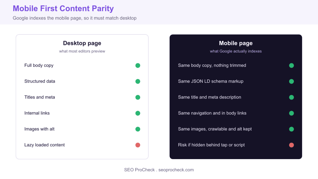
Mobile first indexing means Google uses the mobile version of your page for crawling, indexing, and ranking, so the mobile HTML must contain the same content, structured data, metadata, links, and images as desktop. Sites that served a thinner mobile experience lost rankings, while sites with full parity held steady.
- Whatever you want to rank must exist in the mobile DOM, not just desktop.
- Structured data and meta tags missing from mobile cost rich results and index status.
- Responsive design removes parity risk because one HTML serves all devices.
- The rollout is complete, so mobile first is the permanent baseline with no desktop fallback.
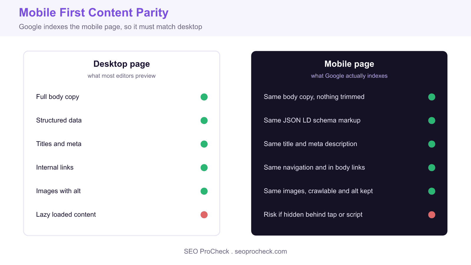
Mobile first indexing means Google predominantly uses the mobile version of a page for crawling, indexing, and ranking. Research into how sites fared through the transition points to one dominant lesson: sites that served a thinner mobile experience than their desktop experience lost rankings, while sites with true content parity held steady. The study below summarises those findings, and the practitioner sections that follow turn them into checks you can run today.
Content parity requirements
Sites with less content on mobile than desktop experienced ranking declines after the mobile first transition. Content hidden on mobile behind accordions or tabs is still indexed, but any content stripped out of the mobile HTML entirely is invisible to Google. The practical rule is blunt: whatever you want to rank must exist in the mobile DOM. Open the page on a narrow viewport, or fetch it with a mobile user agent, and confirm the full article body, headings, and supporting copy are all present.
Technical implementation
Responsive design provides the cleanest mobile first implementation because one HTML document serves every device, which removes parity risk by construction. Separate mobile URLs on an m dot subdomain need correct annotation: the desktop page points to the mobile page with rel="alternate" and the mobile page points back with rel="canonical". Dynamic serving, where the same URL returns different HTML per user agent, needs a Vary: User-Agent header and consistent content across agents. Both non responsive patterns are fragile, and Google now recommends responsive design as the default.
Structured data consistency
Structured data present on desktop but missing from mobile silently strips your rich result eligibility, because Google evaluates the mobile page. Every JSON LD block, from Article to Product to FAQPage, must appear in the mobile HTML. The same holds for the robots meta tag: a page that is indexable on desktop but carries noindex on mobile will be dropped. Check the mobile rendered source, not just the desktop template.
Verification and monitoring
Use the URL Inspection tool in Google Search Console to see the exact HTML Googlebot rendered and to confirm which version was indexed; the crawled as field reads Googlebot smartphone once a property is on mobile first. Run the Rich Results Test on the live URL to confirm structured data is detected in the mobile render. A fast field check is to fetch the page with a mobile user agent and diff the visible text against the desktop fetch.
curl -s -A "Mozilla/5.0 (Linux; Android 13) AppleWebKit/537.36 (KHTML, like Gecko) Chrome Mobile Safari/537.36" https://seoprocheck.com/ -o mobile.html
curl -s -A "Mozilla/5.0 (Windows NT 10.0; Win64; x64) AppleWebKit/537.36 Chrome Safari/537.36" https://seoprocheck.com/ -o desktop.html
python3 -c "import re;g=lambda f:re.sub(r'<[^>]+>',' ',open(f).read());print(len(g('mobile.html').split()),len(g('desktop.html').split()))"
If the mobile word count trails the desktop count by a wide margin, you have a parity gap worth investigating before it costs rankings.
What has changed since this study
Mobile first indexing is no longer a transition, it is the baseline. Google announced that it finished moving the entire web to mobile first indexing, so every new and existing site is now indexed from its mobile version by default. Google also retired the standalone Mobile Usability report and the Mobile Friendly Test tool, folding those signals into broader page experience guidance and Search Console. Core Web Vitals, measured on mobile, now carry the page experience weight that mobile friendliness once did. The parity principle in this study is unchanged and arguably more important, since there is no desktop fallback: the mobile page is the page Google sees.
Parity checklist: desktop versus mobile
| Element | Requirement on mobile | Risk if missing |
|---|---|---|
| Body content | Identical text to desktop | Ranking loss on thin mobile HTML |
| Structured data | Same JSON LD blocks present | Lost rich result eligibility |
| Title and meta | Same title and description | Snippet and relevance drift |
| Internal links | Same crawlable link set | Weaker discovery and link equity |
| Images and alt | Crawlable images, alt retained | Lost image search traffic |
| Robots meta | No mobile only noindex | Page dropped from the index |
Related reading
- Keep your XML sitemaps clean and error free
- The complete guide to XML sitemaps for SEO
- More SEO research studies
Frequently asked questions
What is mobile first indexing?
Mobile first indexing means Google predominantly uses the mobile version of your page for crawling, indexing, and ranking. It does not mean mobile pages rank higher, only that the mobile version is the one Google evaluates, so any content missing from mobile is effectively missing from the index.
Does hidden content on mobile still get indexed?
Yes. Content tucked behind accordions, tabs, or read more toggles is still in the HTML and is indexed normally under mobile first indexing. The danger is content removed from the mobile HTML entirely, which Google cannot see, so hide by CSS if you must, but never strip content out of the mobile markup.
Is responsive design better than a separate mobile site?
For mobile first indexing, yes. Responsive design serves one HTML document to every device, which eliminates parity gaps by construction. Separate m dot URLs and dynamic serving both work but require careful annotation and are far easier to get wrong, which is why Google recommends responsive as the default.
How do I check which version of my page Google indexed?
Use the URL Inspection tool in Google Search Console. The crawled as field shows Googlebot smartphone once your property is on mobile first indexing, and the rendered HTML view lets you confirm your body content, structured data, and metadata are all present in the mobile render.
Will missing structured data on mobile hurt my rich results?
Yes. Because Google evaluates the mobile page, any JSON LD that appears only on desktop is invisible for rich result generation. Make sure every schema block, canonical tag, and meta directive is identical on the mobile version to keep your SERP features.
Is mobile first indexing still being rolled out?
No. Google has confirmed the rollout is complete and the whole web is now indexed mobile first by default. That makes mobile parity a permanent baseline rather than a migration task, and it means there is no desktop version to fall back on if your mobile page is thin.
Source: Mobile-first indexing research compiled
Take this with you
The assistant links open with a question about this page already written. Nothing is sent until you press enter.
Claude Vincent is a technical SEO consultant focused on crawlability, rendering, and AI-search visibility. He writes the field guides and case studies at SEO ProCheck, with a bias toward the durable, unglamorous work that decides whether search engines and AI answer engines can actually read and cite a site.
About SEO ProCheck
Technical SEO consulting and GEO strategy with 20 years of enterprise experience. Case studies, resources, and tools for search and AI visibility.
Work With Me
Technical SEO audits, GEO strategy, site migrations, and international SEO. Hourly consulting for teams who need hands-on support, not just reports.
Subscribe to our newsletter!



Recent Posts
- Most Top Sites Never Say Who They Are in Structured Data October 14, 2026
- Homepage Titles Are Mostly Too Short, Not Too Long October 8, 2026
- Who Actually Serves an llms.txt? 184 Top Sites Measured September 29, 2026