

AI Summary
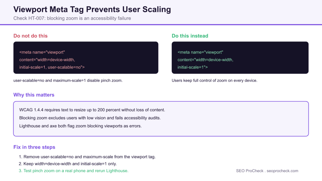
This check flags pages whose viewport meta tag disables zoom, usually through user-scalable=no or maximum-scale=1. Blocking pinch zoom is an accessibility failure under WCAG success criterion 1.4.4, because users with low vision cannot enlarge text to read it. The fix is to remove those restrictions and keep only width=device-width and initial-scale=1.
- Element code HT-007 fires when the viewport tag contains user-scalable=no or maximum-scale=1.
- WCAG 1.4.4 requires text to resize up to 200 percent without loss of content or function.
- The safe viewport value is content="width=device-width, initial-scale=1" with no scale limits.
- Lighthouse, axe DevTools, and a quick View Source check all detect the issue.
Quick Reference
Element Code: HT-007
Issue: Viewport meta tag includes user-scalable=no or maximum-scale=1
Impact: Users cannot zoom, creating accessibility barriers
Fix: Remove user-scalable=no and maximum-scale restrictions
Detection: Lighthouse, axe DevTools, View Source
What Is This Issue?
Preventing zoom creates significant accessibility problems for users with low vision who need to enlarge content. This violates WCAG requirements for text resizing.
Why This Matters for Your Website
WCAG requires that text can be resized up to 200% without loss of functionality. Blocking zoom prevents this and excludes users who need magnification.
How to Fix This Issue
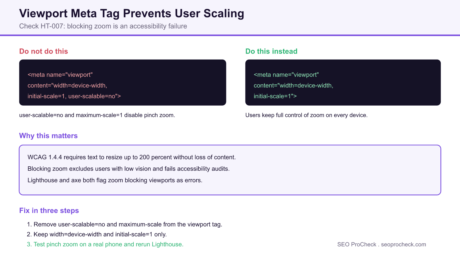
- Remove restrictions: Delete user-scalable=no and maximum-scale=1
- Use recommended viewport: width=device-width, initial-scale=1
- Test zoom: Verify pinch-zoom works on mobile
Tools for Detection
- Lighthouse: Flags zoom-blocking viewports
- axe DevTools: Accessibility violation report
TL;DR (The Simple Version)
Your viewport tag prevents zooming. Remove user-scalable=no and maximum-scale=1 so people who need to zoom can still read your content.
How the viewport tag controls zoom
The viewport meta tag tells a mobile browser how to lay out the page. Two of its properties can lock zoom. user-scalable=no disables pinch to zoom entirely. maximum-scale, when set to 1, caps how far a user can enlarge the page, which has the same practical effect. minimum-scale can similarly trap users at an unusable zoom level. This check fires when any of those restrictions are present, because each one takes zoom control away from the person using the page.
Developers often add user-scalable=no to stop a layout from breaking or to mimic a native app feel. Modern responsive CSS makes that unnecessary, and the accessibility cost is not worth it. A well built responsive layout stays usable while still letting people zoom.
Viewport properties and their effect on zoom
| Property | Example value | Effect | Recommended |
|---|---|---|---|
| width | device-width | Matches layout to screen width | Yes |
| initial-scale | 1 | Sets starting zoom level | Yes |
| user-scalable | no | Disables pinch zoom entirely | No, remove it |
| maximum-scale | 1 | Caps zoom so users cannot enlarge | No, remove it |
| minimum-scale | 1 | Traps users at a fixed zoom | No, avoid it |
Related checks
This check is part of a family of viewport and mobile structure checks. See also viewport maximum scale restriction, a missing viewport meta tag, a wrong initial scale value, and how rankings differ between mobile and desktop.
Frequently Asked Questions
What does user-scalable=no do?
It disables pinch to zoom on mobile browsers, so users cannot enlarge the page. This blocks people with low vision from reading small text and fails WCAG success criterion 1.4.4, which is why this check flags it.
Is blocking zoom bad for SEO?
It is primarily an accessibility failure rather than a direct ranking penalty, but it hurts mobile usability, which Google evaluates, and it fails Lighthouse accessibility audits. Since Google indexes mobile first, a poor mobile experience can indirectly affect performance.
What is the correct viewport meta tag?
Use content="width=device-width, initial-scale=1" with no scale limits. This adapts the layout to the device, sets a sensible starting zoom, and leaves users free to zoom in and out.
Can I still set maximum-scale if I keep zoom mostly enabled?
Avoid it. Setting maximum-scale to 1 or a low value caps how far users can enlarge content, which recreates the same accessibility problem. Leave scale limits off entirely so people can zoom as much as they need.
How do I detect this issue?
Run Lighthouse or axe DevTools, both of which flag zoom blocking viewports, or simply View Source and inspect the viewport meta tag for user-scalable=no, maximum-scale, or minimum-scale. Confirm the fix by pinch zooming on a real phone.
Why did a developer add user-scalable=no in the first place?
It is often added to stop layout shifts or to make a site feel more like a native app. Modern responsive CSS removes the need for it, so the restriction can almost always be deleted without harming the design.
Take this with you
The assistant links open with a question about this page already written. Nothing is sent until you press enter.
Claude Vincent is a technical SEO consultant focused on crawlability, rendering, and AI-search visibility. He writes the field guides and case studies at SEO ProCheck, with a bias toward the durable, unglamorous work that decides whether search engines and AI answer engines can actually read and cite a site.
About SEO ProCheck
Technical SEO consulting and GEO strategy with 20 years of enterprise experience. Case studies, resources, and tools for search and AI visibility.
Work With Me
Technical SEO audits, GEO strategy, site migrations, and international SEO. Hourly consulting for teams who need hands-on support, not just reports.
Subscribe to our newsletter!



Recent Posts
- Most Top Sites Never Say Who They Are in Structured Data October 14, 2026
- Homepage Titles Are Mostly Too Short, Not Too Long October 8, 2026
- Who Actually Serves an llms.txt? 184 Top Sites Measured September 29, 2026